
Nomadic Botanicals
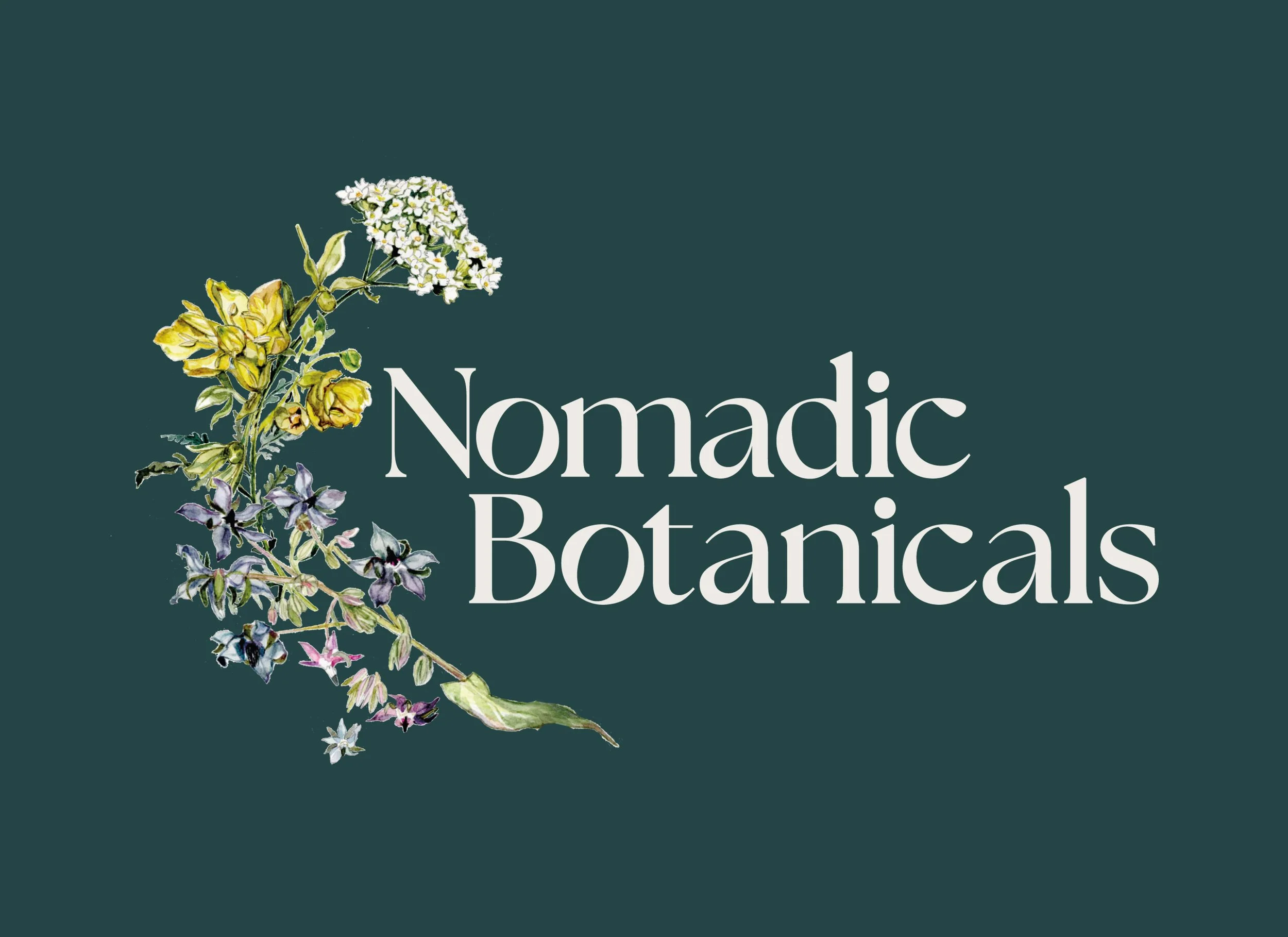
Nomadic Botanicals crafts small-batch herbal blends and tinctures using botanicals grown and harvested by the owner herself. When she approached me, she had one key element: an illustration by local artist @goodonekarin that needed to anchor the entire brand. The result is a cohesive identity that honors both the handcrafted product and the artwork that inspired it.


-
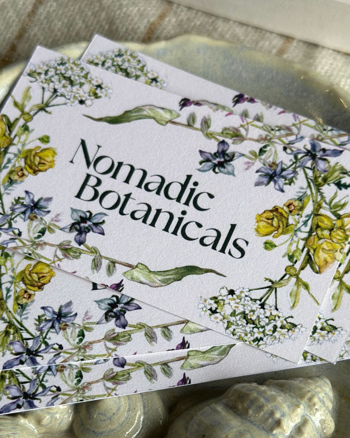
The heart of this brand is @goodonekarin's botanical illustration: delicate, organic, wildly beautiful. My job was to let it shine while building an identity around it.
I reimagined the illustration as a living bouquet that wraps around the brand name, creating movement and softness. The typeface, Seasons, felt like the perfect pairing—organic but grounded. I angled the "O"s forward to echo the idea of movement, like wheels turning on a journey (nomadic, after all).
The color palette pulls straight from nature: mossy greens, warm browns, soft neutrals. Everything feels like it grew from the same soil as the botanicals inside the bottles.
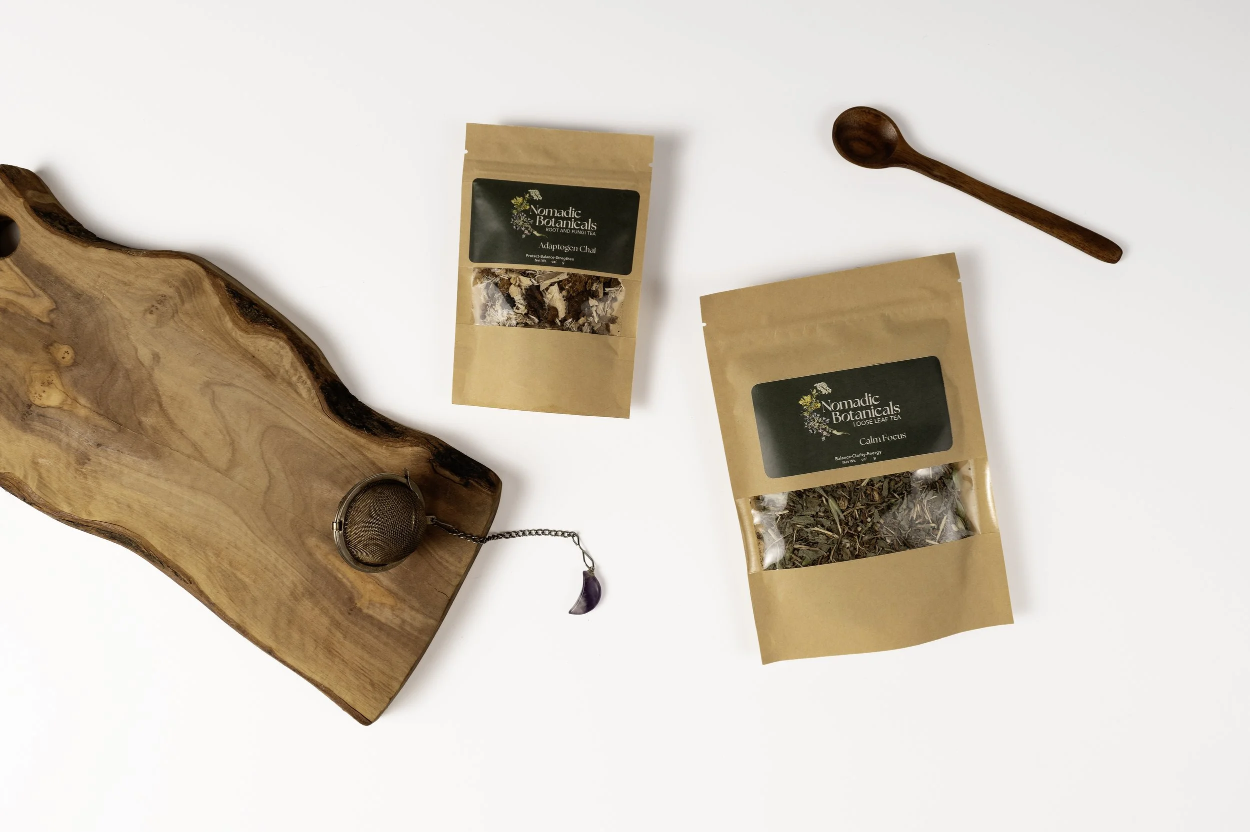
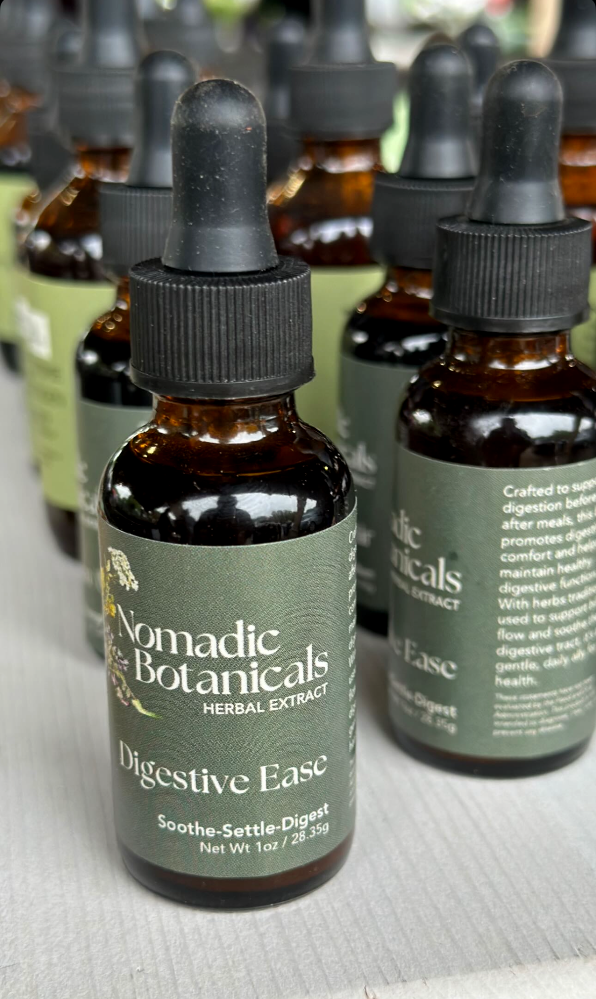
For the labels, we used a deep green backdrop with cream text to keep things earthy and readable. Since Pamela makes so many different blends, I set up the label templates in Canva so she can easily swap out product names, ingredients, and descriptions herself—no designer needed every time she creates something new.
The result is a brand that feels as handcrafted and intentional as the products themselves.
-
Client: Nomadic Botanicals
Industry: Herbal Apothecary & Wellness
Services: Brand Identity, Logo Design, Label System, Business Cards
Year: 2025
Collaborator: @goodonekarin Botanical Illustration
Project Brief: Create a cohesive brand identity that honors a hand-drawn botanical illustration while maintaining flexibility for multiple product lines.
Solution: Custom logo design integrating the illustration as a living bouquet, Canva-based label templates for easy product updates, and an earthy color palette that reflects the natural origins of the products.