
RNK Marketing
RNK Marketing is the company behind Georgia Salsa and Peachtree Gourmet, two brands dedicated to showcasing the rich, vibrant flavors of Georgia family farms. They needed logos that could capture the spirit of their products and photography that told the story of what's inside every jar. That's where I came in.


-
Client: RNK Marketing (Georgia Salsa & Peachtree Gourmet)
Industry: Specialty Foods & Gourmet Products
Services: Logo Design, Product Photography, Lifestyle Photography
Year: 2023 - Present
Project Brief: Create two distinct but complementary logos for Georgia-sourced specialty food brands, along with product photography for e-commerce and marketing.
Solution: Georgia Salsa logo featuring the state silhouette filled with vibrant produce for a festive, farm-fresh feel. Peachtree Gourmet logo integrating the "P" with a peach tree illustration for elegant, whimsical branding. Hero and lifestyle product photography showcasing jars with styled ingredients and serving suggestions.
-
The brief was simple but specific: create two logos that scream "Georgia farm fresh" while still feeling gourmet. Georgia Salsa needed energy and fun. Peach Tree Gourmet needed elegance with a little whimsy. Both needed to make it obvious where the products come from.
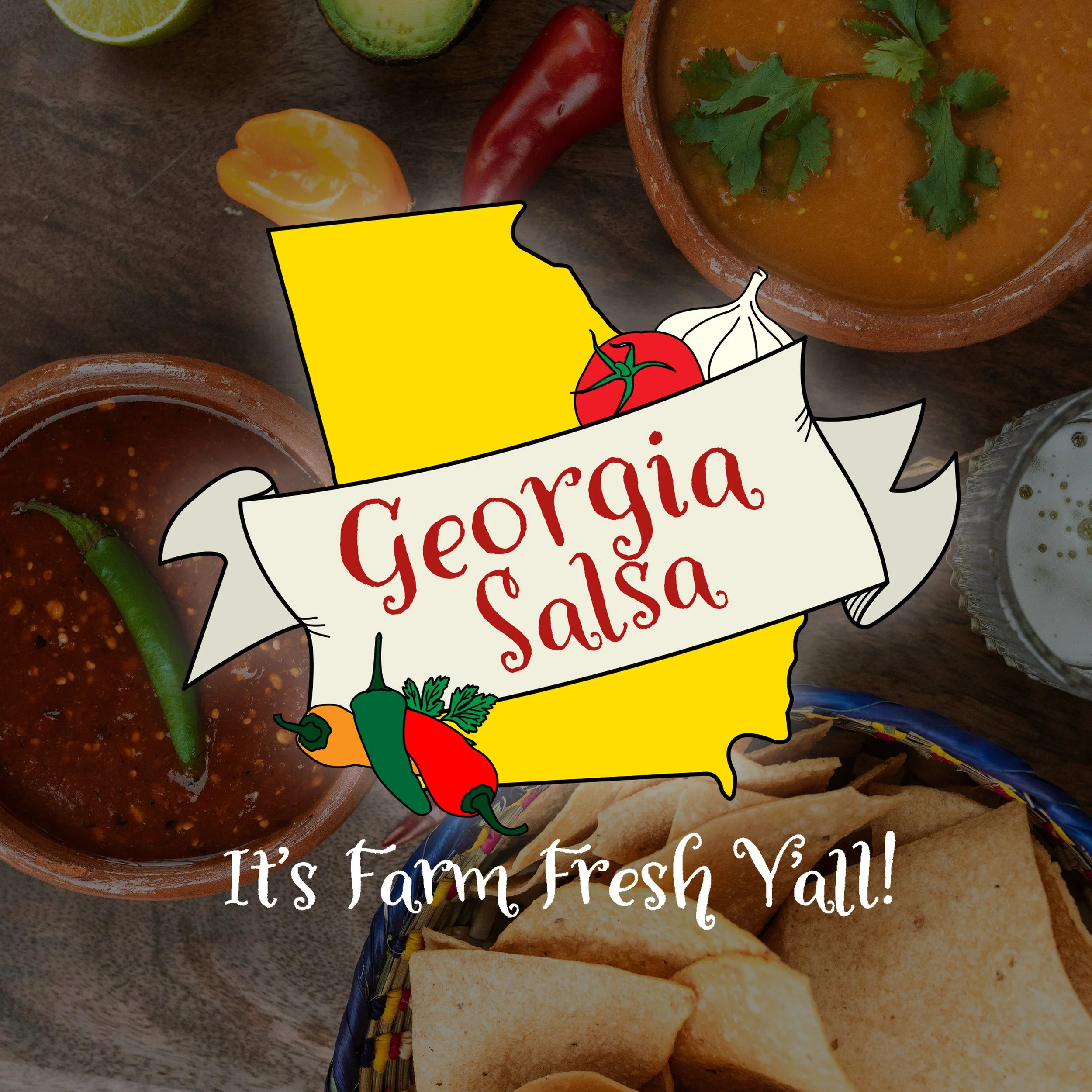
Georgia Salsa
For Georgia Salsa, I knew the logo needed to celebrate two things: the bold, festive spirit of salsa and the pride of Georgia-grown ingredients. I sketched out ideas that played with both: some leaned playful and fiesta-ready, others felt more classic and farm-focused. The question was how to marry the two without losing either vibe.
The final design brings them together. The state of Georgia sits front and center, filled with vibrant produce in colors that feel as lively as the salsa inside the jar. It's fun without being gimmicky, grounded without being boring. The logo does exactly what it needs to do: tell you where it's from and make you want to open a bag of chips.
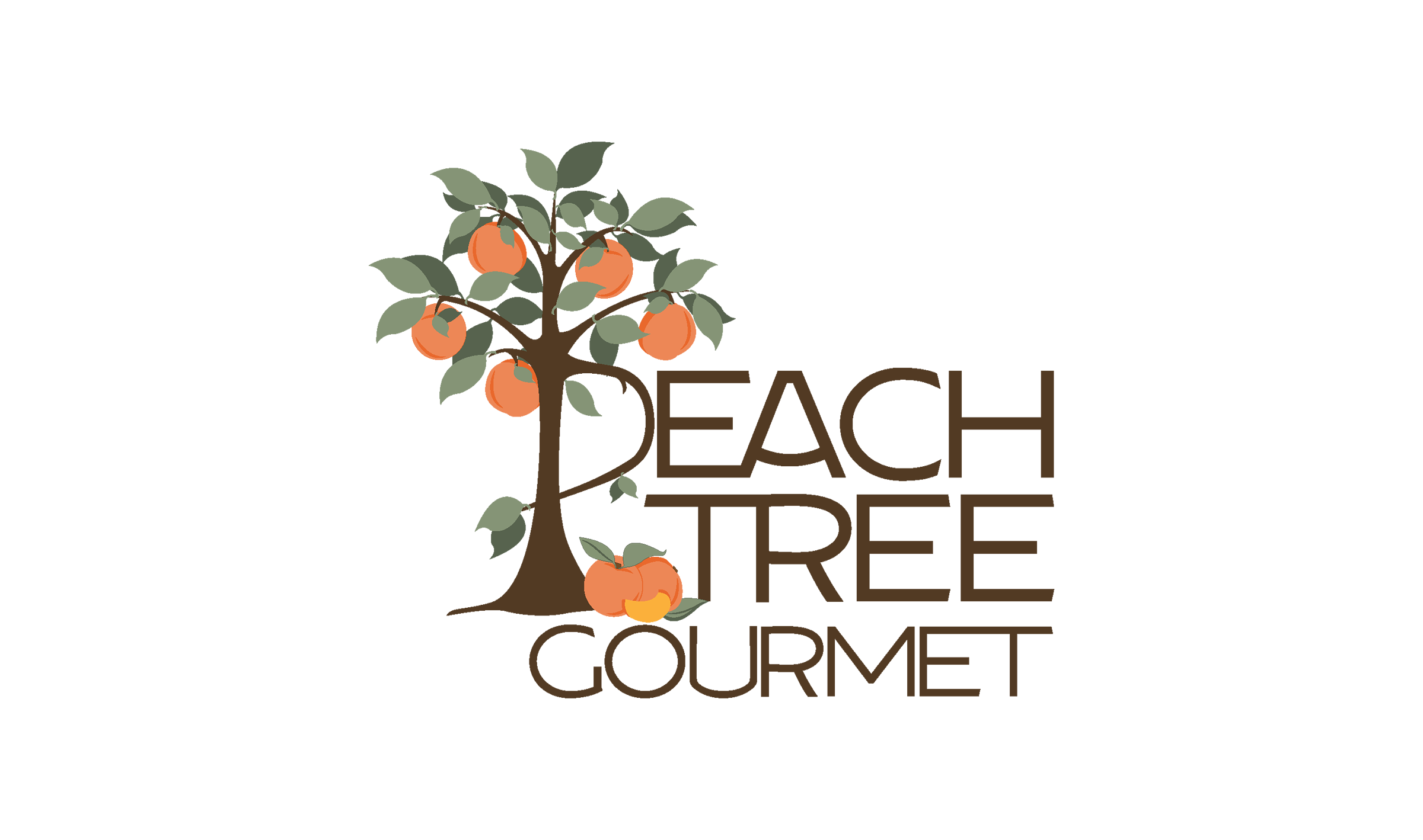
Peach Tree Gourmet
Peach Tree Gourmet is Georgia Salsa's sister brand, but the vibe needed to be softer, more refined. Jams and jellies deserve a little elegance. I started with the obvious imagery: peach trees, fruit on branches, rolling farm fields. The early concepts were clean and charming, but they weren't quite there yet.
Then the client had a brilliant idea: what if the "P" in Peach became part of the tree? That one suggestion unlocked everything. Suddenly the logo had movement and cohesion. The typography stacked beautifully, the tree felt intentional instead of decorative, and the whole thing came together with a whimsical-but-polished energy that matches the brand perfectly.
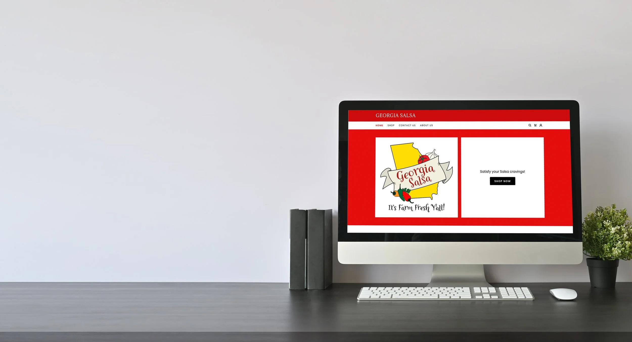
Both logos now live on jars across Georgia (and beyond), doing exactly what they were designed to do: look good on a shelf and make you want to taste what's inside.
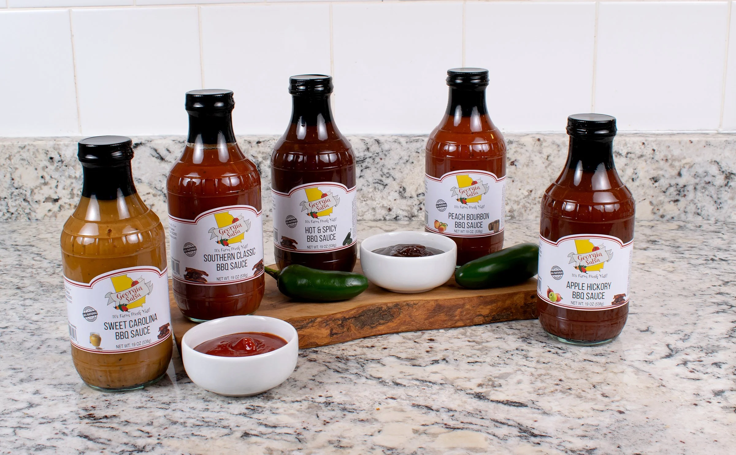
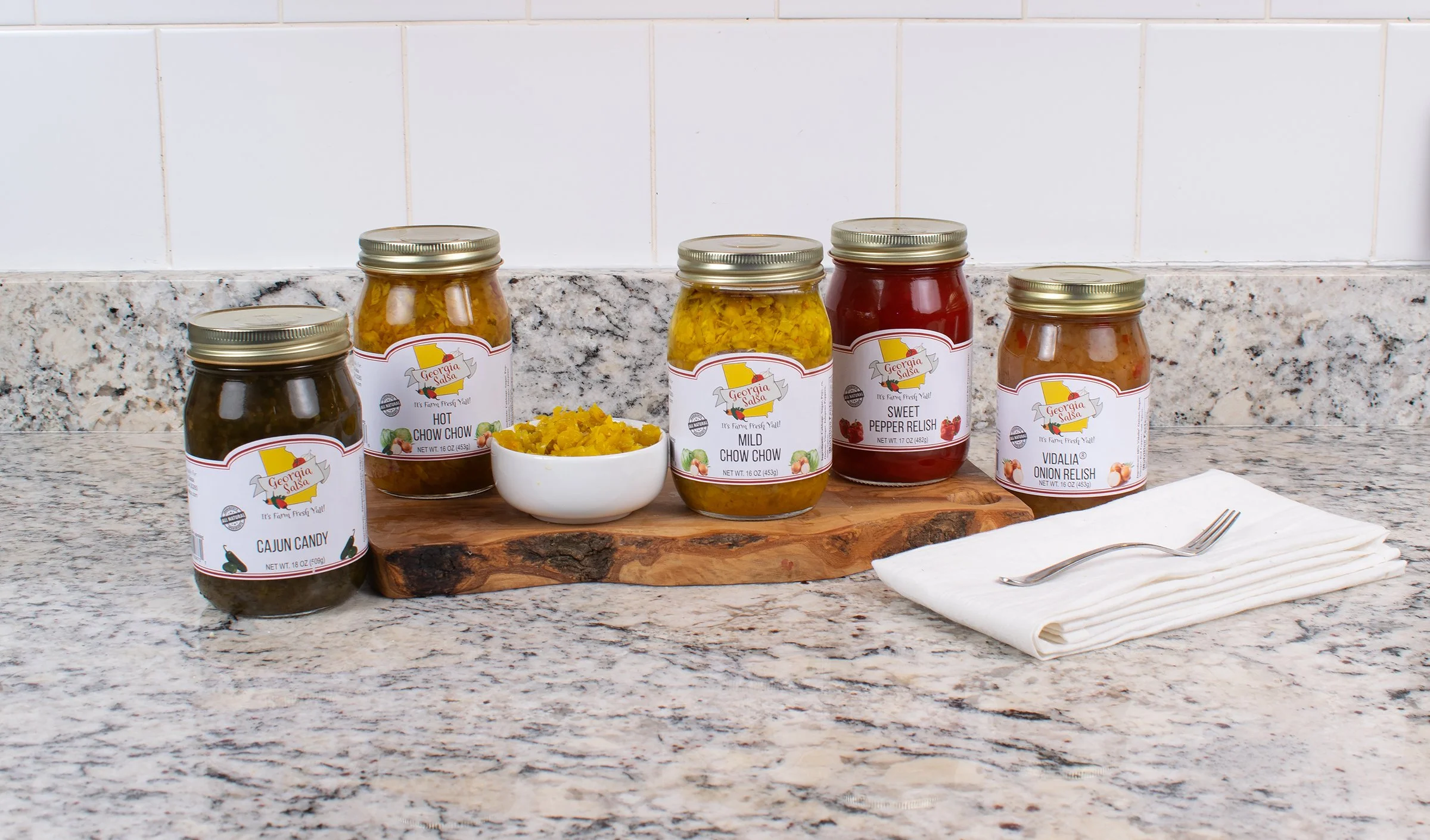
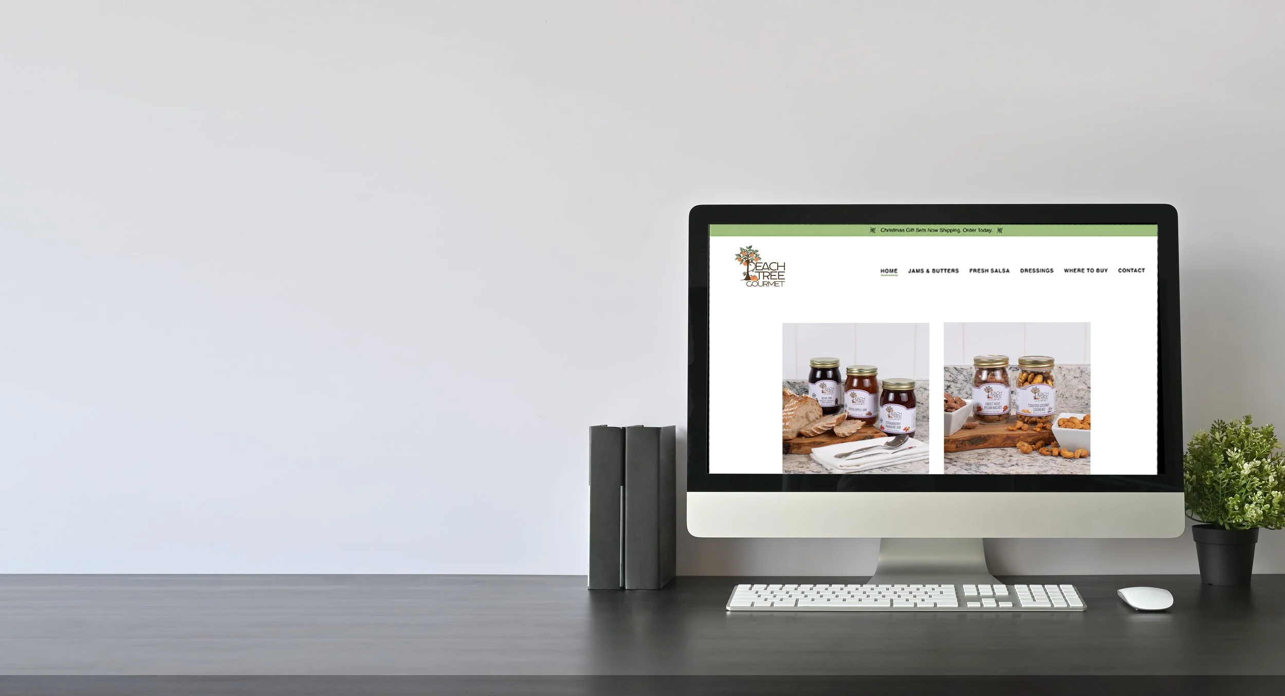
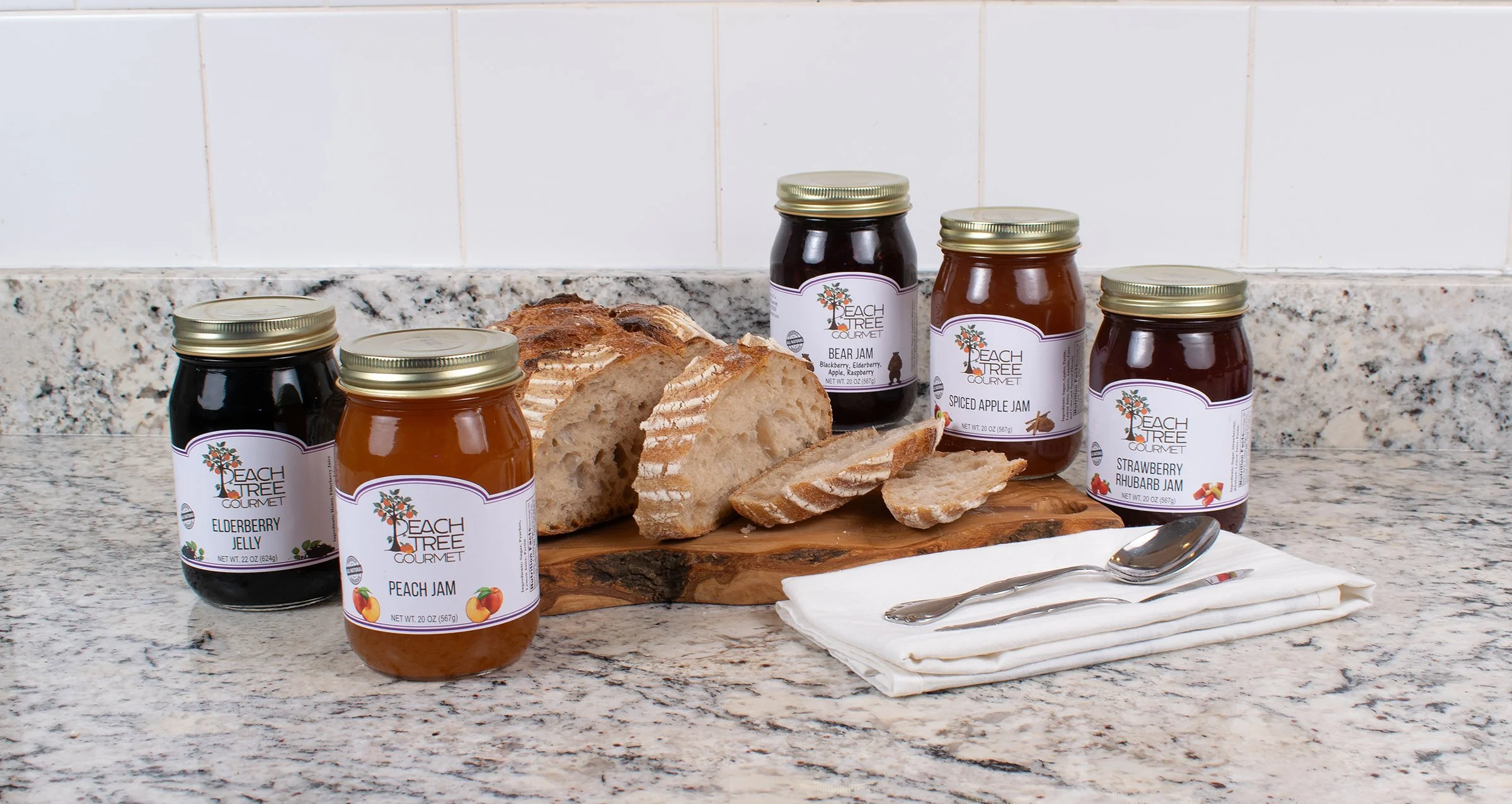
The Photography
Beyond the logos, I shot all the product photography for the Georgia Salsa website. Each jar got its own hero shot, clean and crisp so the product could shine. Then I styled lifestyle shots: jars grouped with fresh ingredients, bread, charcuterie boards—scenes that make you hungry and help you imagine how you'd actually use the products.
The goal was to create images that felt as vibrant and appetizing as the flavors themselves, photography that told the story of what's inside every jar.
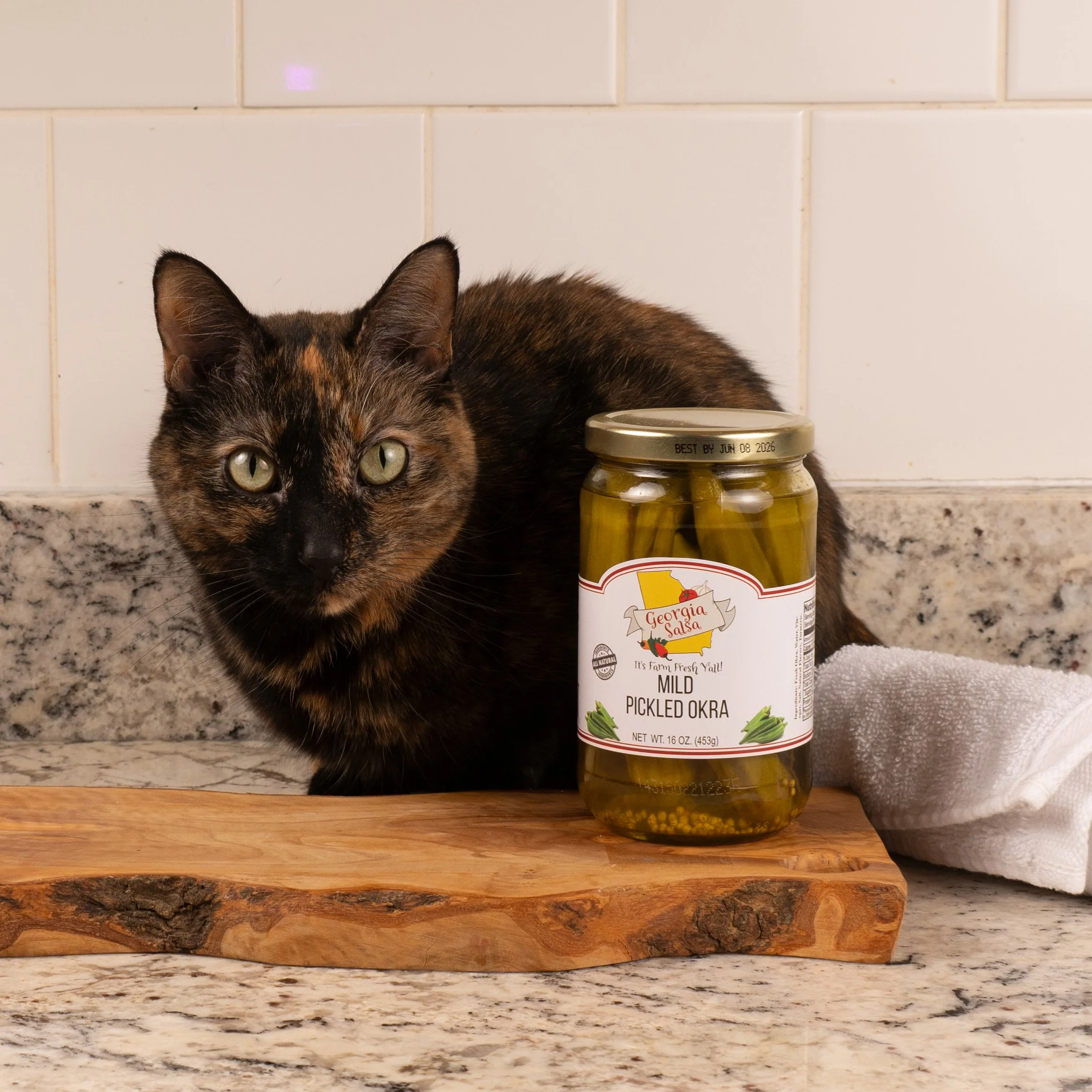
(For those of you still here: bonus behind-the-scenes moment. My cat Ruby decided the pickled okra needed a proper introduction. She's available for future product modeling gigs.)