
Chicago Warriors Baseball
Chicago Warriors Baseball is a youth baseball program in Chicago where my son has been a player since 2019. For the past few years, I've also been their go-to for all things design. From their logo and jerseys to building signage, magnets, and game-day photography, I've helped shape the visual identity that represents this team.


-
Client: Chicago Warriors Baseball
Industry: Youth Sports / Baseball
Services: Jersey Graphics, Logo Design, Building Signage, Car Magnets, Game-Day Photography
Year: 2022 - Present
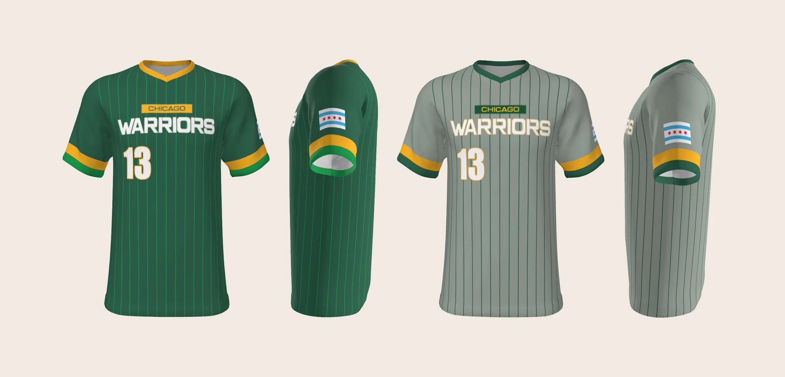
Project Brief: Create bold, recognizable team graphics for jerseys and spirit wear that capture the competitive energy of the program, plus photography to showcase players and build community engagement.
Solution: Custom typography based on Eurostyle Extended, modified for weight and presence. Multiple colorway options tested to work across black and green team uniforms. Designed scalable graphics for apparel, signage, and promotional materials. Ongoing game-day photography for social media, website, and family keepsakes.
Personal Connection: My son has been a Warriors player since 2019, making this an especially meaningful ongoing collaboration with the organization.
-
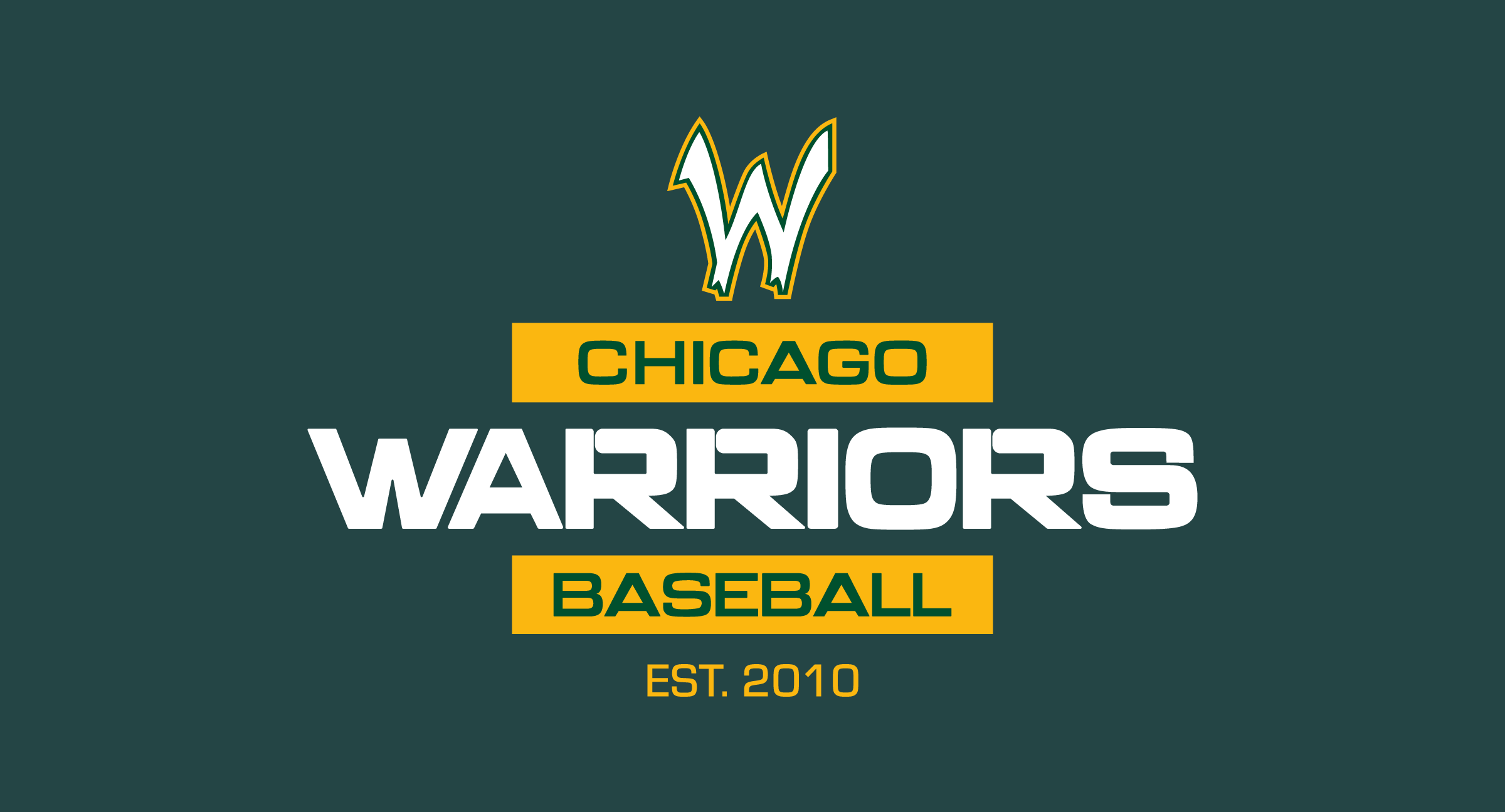
The most visible piece of this work is the graphic that now lives on jerseys, hoodies, and spirit wear across the program. The founder came to me with a screenshot from the 2022 MLB postseason, a bold, blocky design he wanted to adapt for the Warriors. He knew what he wanted, he just didn't know how to make it happen. That's where I came in.
I started by hunting down a typeface that matched the energy of the original: Eurostyle Extended. Close, but not quite there. So I customized it. I widened some letters, added rounded breaks to others, and manipulated the shapes until they had the weight and presence we needed.
Then came the fun part: testing every possible color combination. Green text on black. Black text on green. Yellow accents. White outlines. We tried it all because you never really know what's going to work until you see it on the uniform. After cycling through countless variations, we landed on the versions that felt right, bold and clean on both the team's black and green base colors.
The graphic now lives on jerseys, hoodies, and team signage. He's entering the 17U team for the 2026 season now, and I get to see kids and coaches wearing the design I helped create every time I'm at the field. It never gets old.
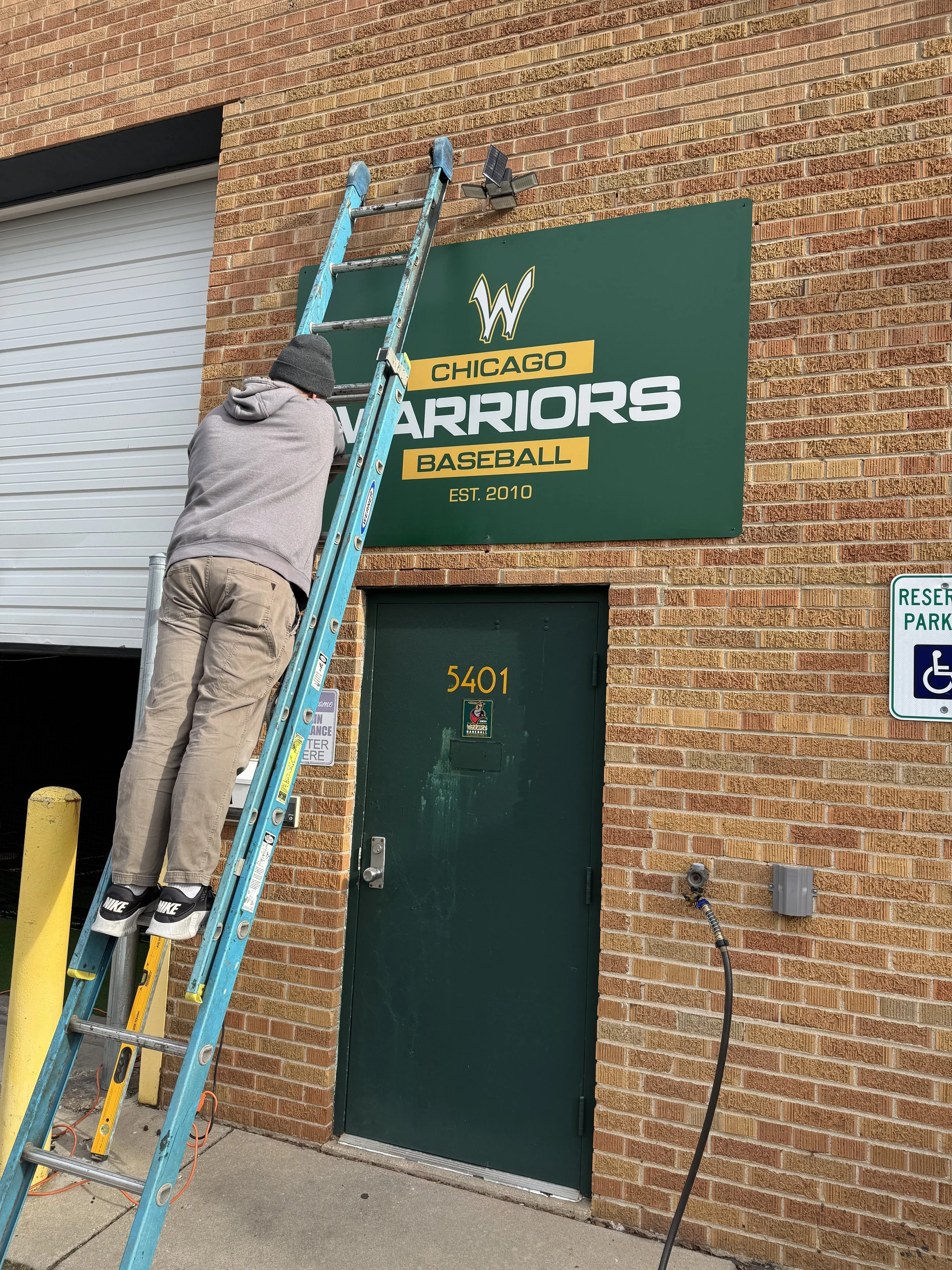
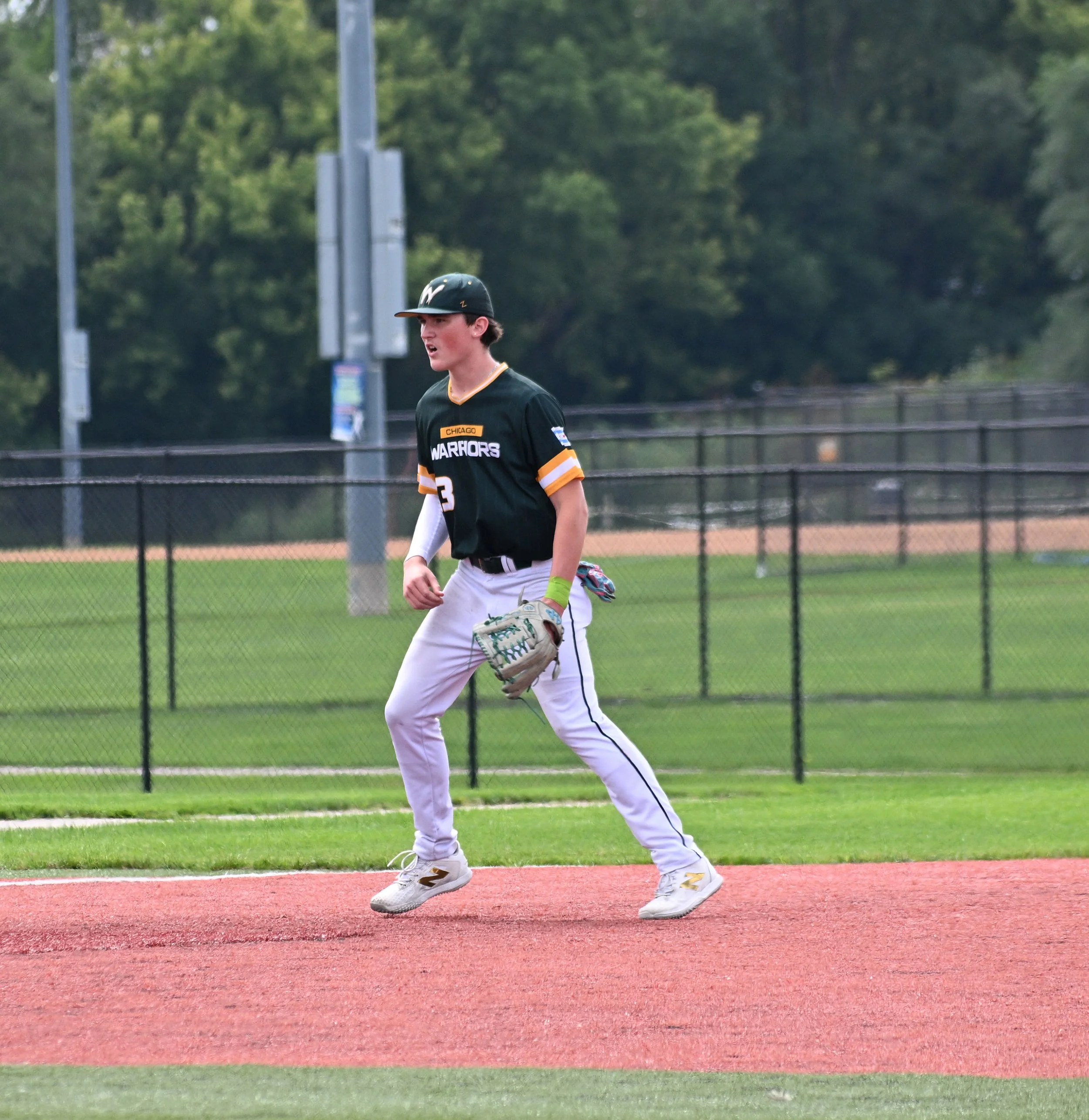
Beyond the apparel, I've designed building signage for their facility and car magnets for families to rep the team. And since I'm at most games anyway, I shoot action photos of the players, my son's team especially, but I cover other age groups too. The photos capture the uniforms in action, give families images they'll actually want to keep, and get used across the Warriors' social media and website.
This project has been ongoing for years. It's one of those rare projects where the work keeps evolving, and I get to see it come to life every season.