
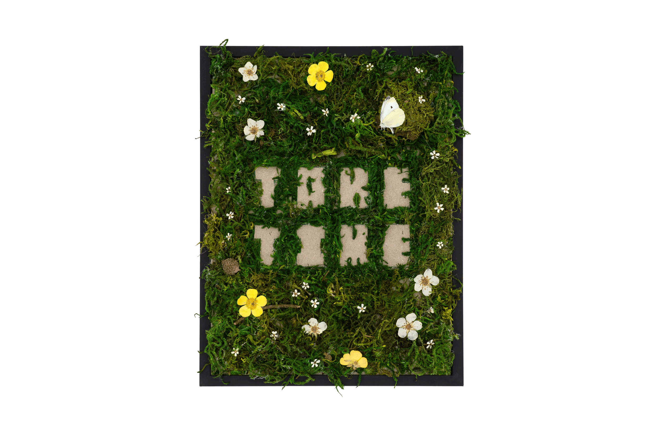
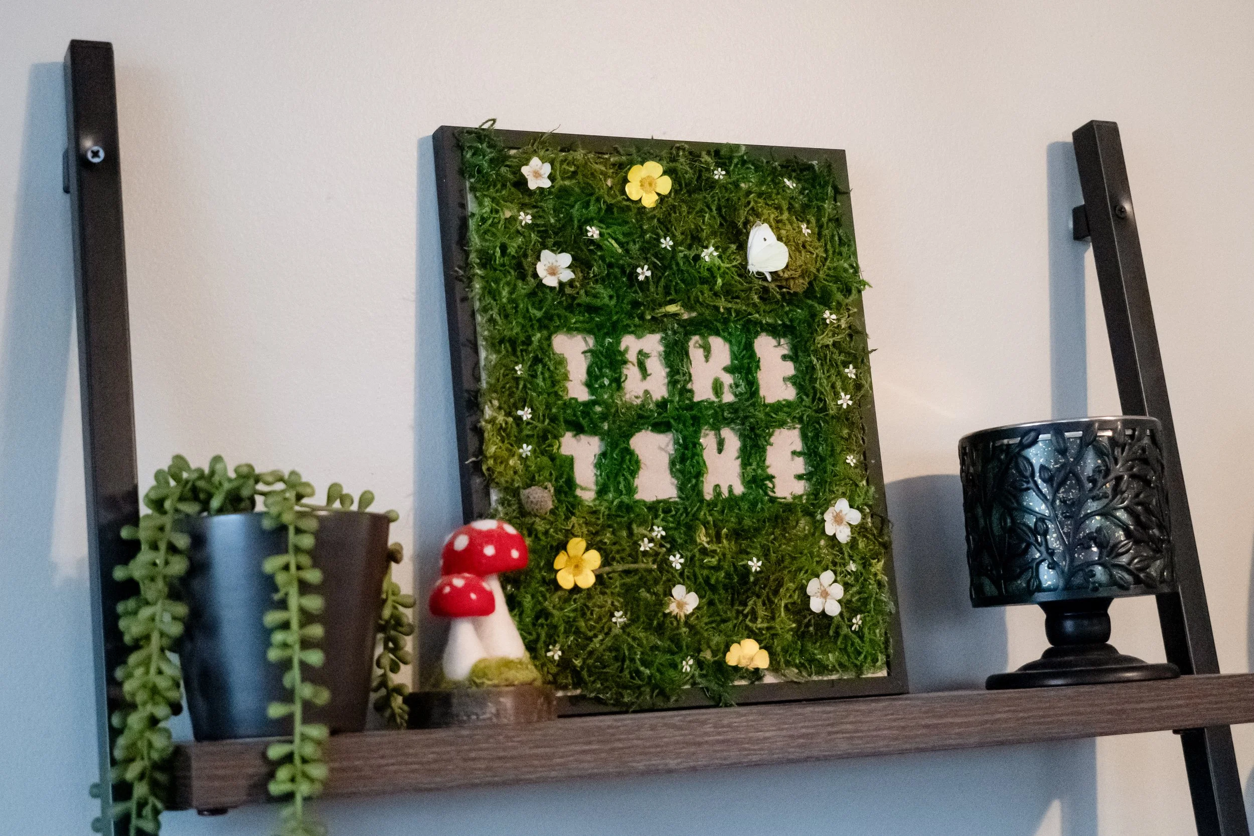
Take Time
Take Time is a personal project that started with no plan at all. Just me, some blocky letters, and a lot of messing around. What it became was a reminder I didn't know I needed: that good things take time, and sometimes the best ideas reveal themselves when you stop forcing them.

-
Project Type: Personal Art / Mixed Media
Medium: Pressed flowers, moss, typography, found objects
Year: 2025
Featured In: Chicago Graphic Design Club, Faculty Issue 2, 2025
Project Brief: Create a personal art piece exploring themes of patience, growth, and transformation through natural materials and hand-lettering.
Process: Hand-drawn blocky typography served as the foundation. Pressed wildflowers collected from Chicago natural areas, live moss, and a preserved butterfly were layered to create organic texture. The piece evolved intuitively rather than from a predetermined plan, reflecting the theme of letting creativity unfold naturally.
Outcome: Featured in CGDC's Faculty magazine and exhibited as part of the Chicago design community's showcase of creative work.
-
This piece didn't start as art. It started as play. I was sketching chunky, blocky letters with no real direction, just exploring. At the same time, I'd been pressing flowers from my walks around the city, a quiet hobby I've kept up for years. One day, while organizing finished pressed flowers for storage, the two worlds collided. What if the letters became the foundation for something bigger?
I grabbed some moss, fired up the glue gun, and let it happen. The blocky letters became a base. The moss became a living texture. Then came the pressed flowers, a butterfly, tiny details that turned the whole thing into something organic and alive.
The piece is called Take Time because that's exactly what it required. Moss grows slowly. Caterpillars transform into butterflies over weeks. Acorns take years to become oak trees. Flowers wait all winter to bloom. Every element in this piece tells a story of patience and transformation, things I personally struggle with but constantly need to be reminded of.
Creating it forced me to slow down, trust the process, and let the idea come to me instead of chasing it. The result is a gentle reminder that beauty doesn't rush. It unfolds.
This piece was featured in the Chicago Graphic Design Club's second issue of Faculty magazine. You can grab a copy of the magazine through the CGDC website.