
Pixel Pump - Designer Challenge
Designer'obics Pixel Pump is a totally rad VHS workout video sleeve concept I created for the Print Design Academy's Color Bar Challenge. The brief? Design the most outrageous '80s VHS jacket for a fictional workout video targeting designers and creatives. This was pure creative fun, bright colors, bold typography, Memphis patterns, and all the nostalgic vibes of the era when leg warmers and leotards ruled. My design was selected as one of the top five winners and printed as an actual VHS sleeve.

-
Project Type: Personal /Design Challenge
Challenge: Print Design Academy Color Bar Challenge 2023
Concept: VHS workout video sleeve for "Designer'obics Pixel Pump: The Ultimate Workout for Creatives"
Year: 2023
Recognition: Selected as Top 5 Winner—design printed as actual VHS sleeve
Project Brief: Design an outrageous '80s-inspired VHS jacket that captures the bold, playful aesthetic of the decade while speaking directly to designers and creatives.
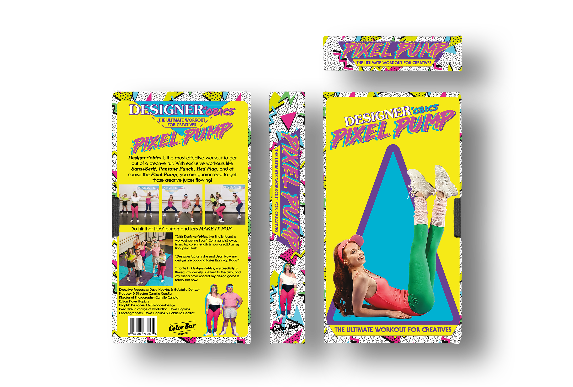
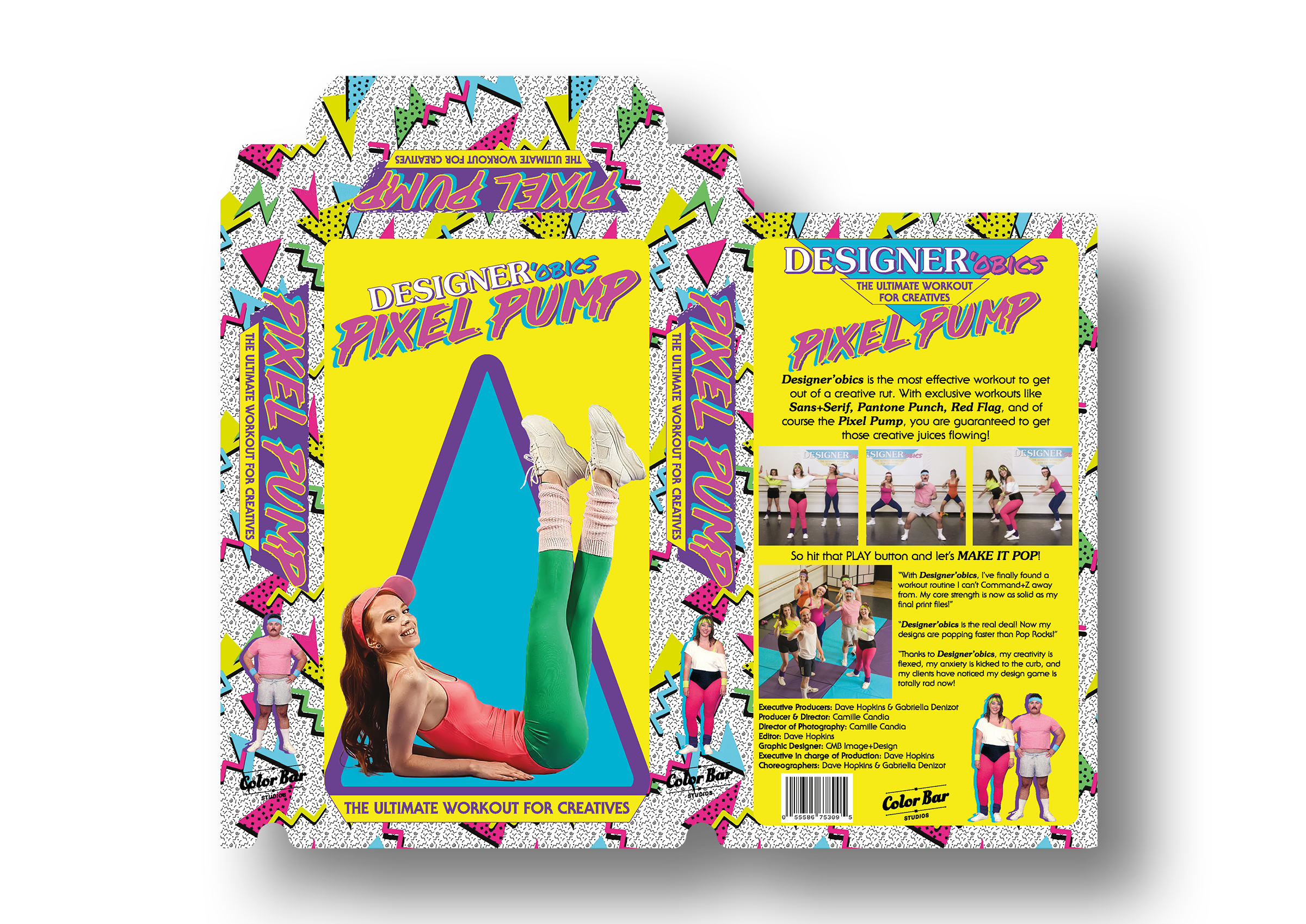
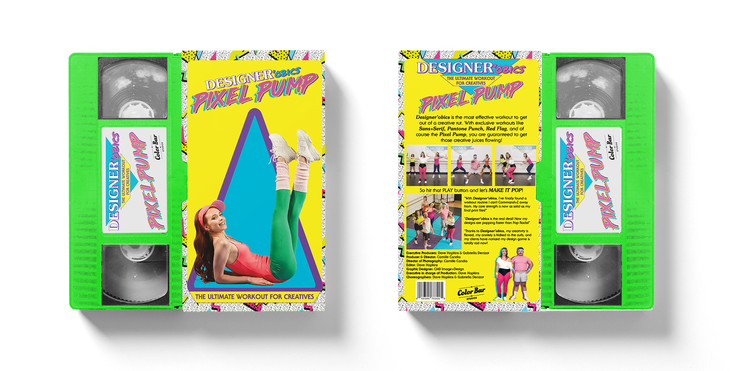
Design Approach: Full-throttle '80s aesthetic with neon color palette (yellow, pink, blue), Memphis pattern textures, dimensional typography, retro workout imagery, and playful copy. Included fake testimonials, production credits, and an Easter egg UPC code (555.867.5309).
Outcome: Selected as one of five winning designs and printed as a physical VHS sleeve by Print Design Academy. A reminder that creative projects don't always need a client—sometimes the best work comes from pure play.
Special Thanks: Print Design Academy (Dave Hopkins & Gaby Deniozr) for hosting the Color Bar Challenge and keeping print design fun.
-
This project pushed me way outside my comfort zone, and that's exactly why I loved it. The Color Bar Challenge from Print Design Academy asked designers to create a VHS tape sleeve that screamed 1980s excess while speaking directly to the design community. The concept: Designer'obics Pixel Pump, "The Ultimate Workout for Creatives."
I leaned hard into the aesthetic. Neon yellow, hot pink, electric blue, and that signature Memphis pattern texture that defined the decade. The typography needed to feel like it was ripped straight from a Saved by the Bell intro—layered, dimensional, playful. I used bold sans-serifs with heavy outlines and shadows to capture that unmistakable '80s energy.
The front features a Print Design Academy model in classic workout gear striking a pose in front of oversized geometric shapes. The back includes workout stills of the PDA team, fake testimonials ("With Designer'obics, my creativity is flexed, my anxiety is kicked to the curb, and my clients have noticed my design game is totally rad now!"), and production credits listing the PDA team
My favorite detail? The UPC barcode uses 555.867.5309. If you know, you know.
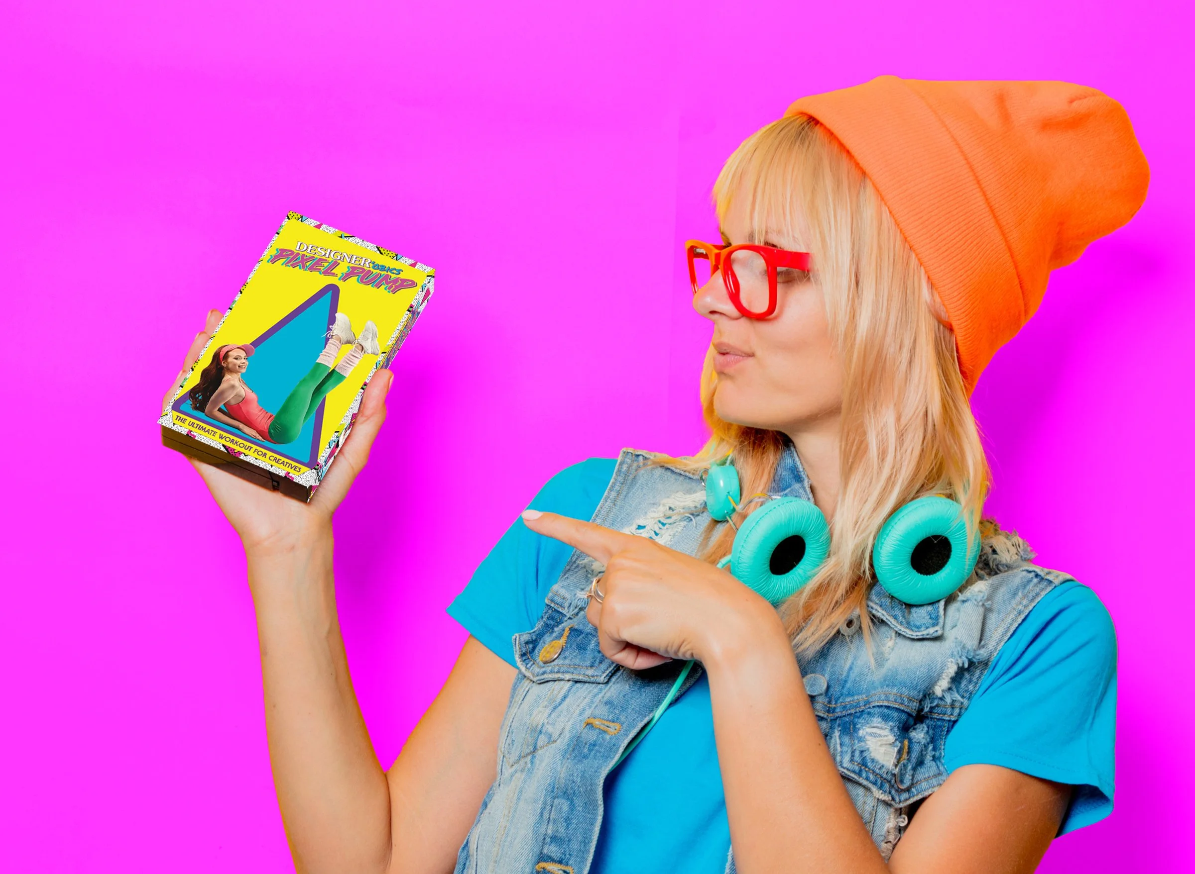
Out of all the submissions, my design was selected as one of the top five winners. Print Design Academy actually printed it as a real VHS sleeve—seeing something I designed for fun transformed into a physical object you can hold was surreal. It's one thing to create digital work; it's another to see it printed and celebrated by a community of designers who appreciate the craft.
This project reminded me why I love what I do. We take our work seriously, but we also know how to play. Sometimes the best creative work happens when there are no constraints—just pure nostalgic fun.