New Century Art Guild
New Century Art Guild is a 501(c)(3) nonprofit supporting Veteran artists through professional, recreational, and therapeutic programming, by Veterans, for Veterans. The Chicago chapter needed a way to introduce its programming to the Veterans it serves, so I built a brand identity for it, starting with a presentation deck for a single talk. Rack cards, business cards, and a full website followed, all carrying that same identity. National liked it enough to adopt it for their own site. The result is a cohesive color story, typography system, and voice now running across the organization.
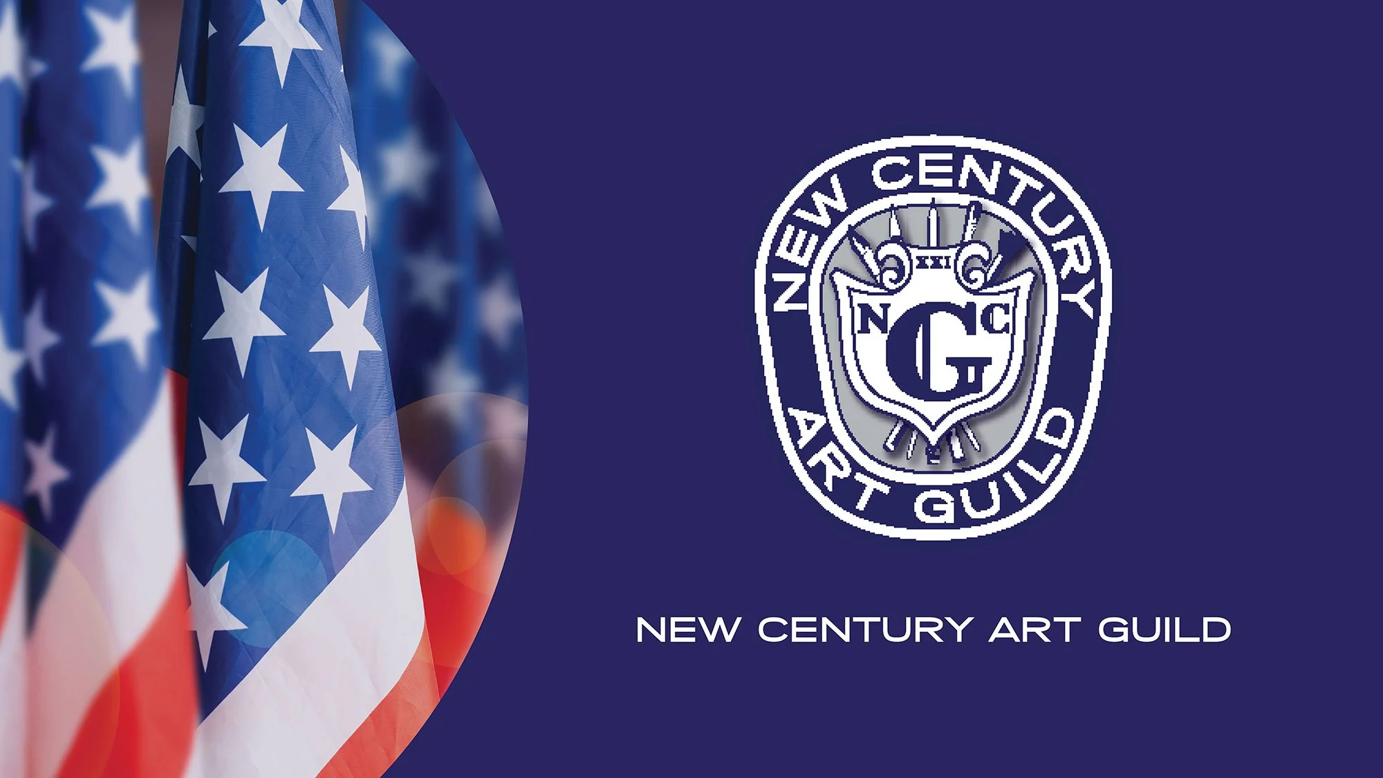
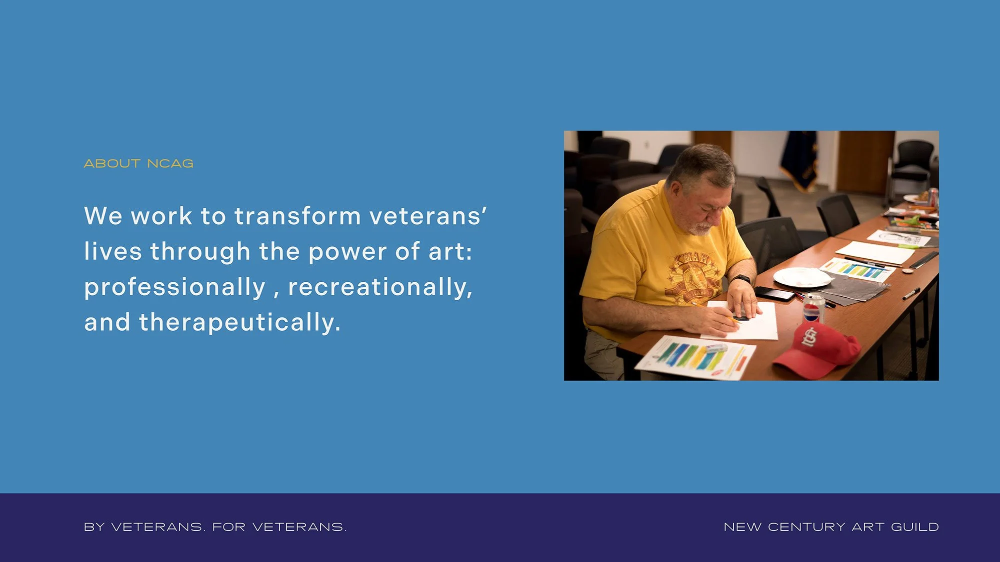
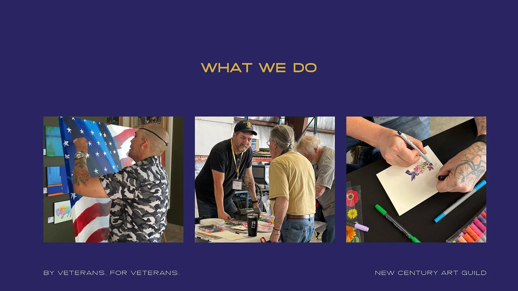
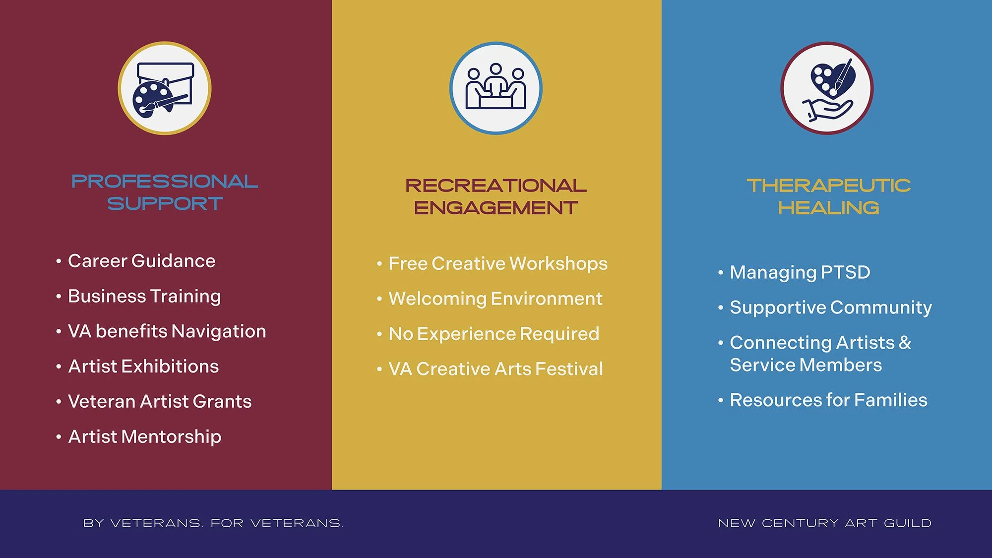
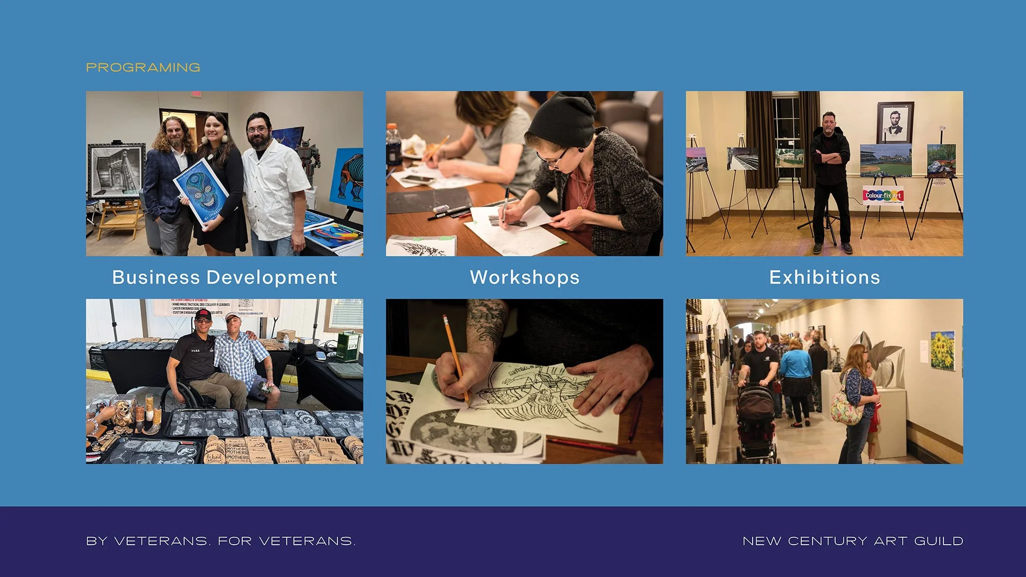
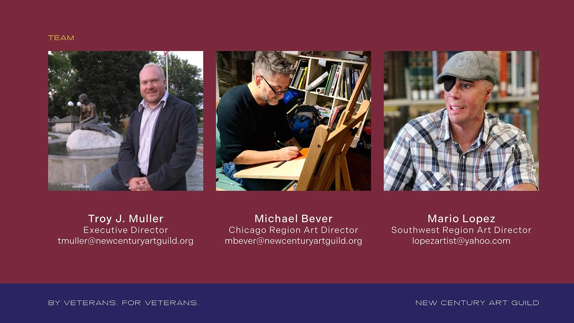
Presentation Deck for NCAG Chicago
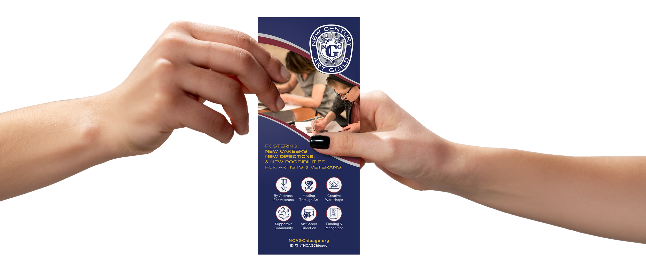
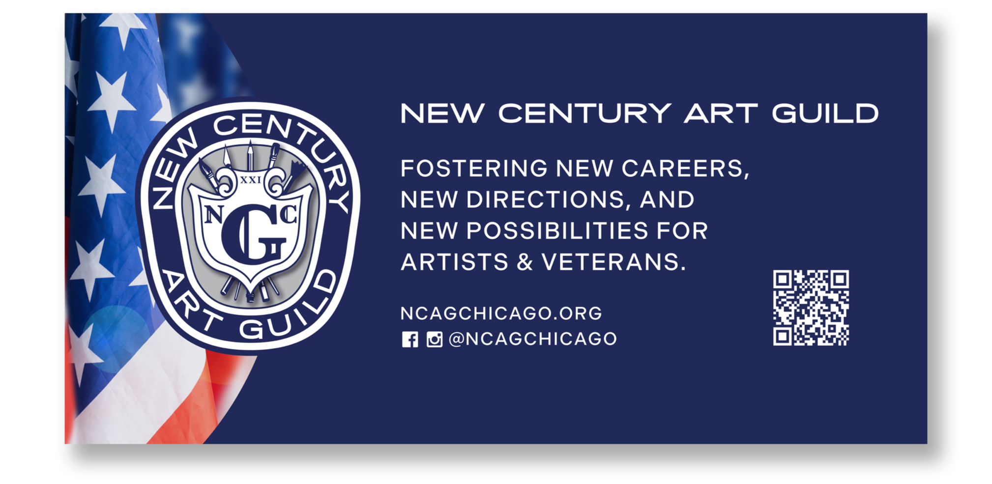
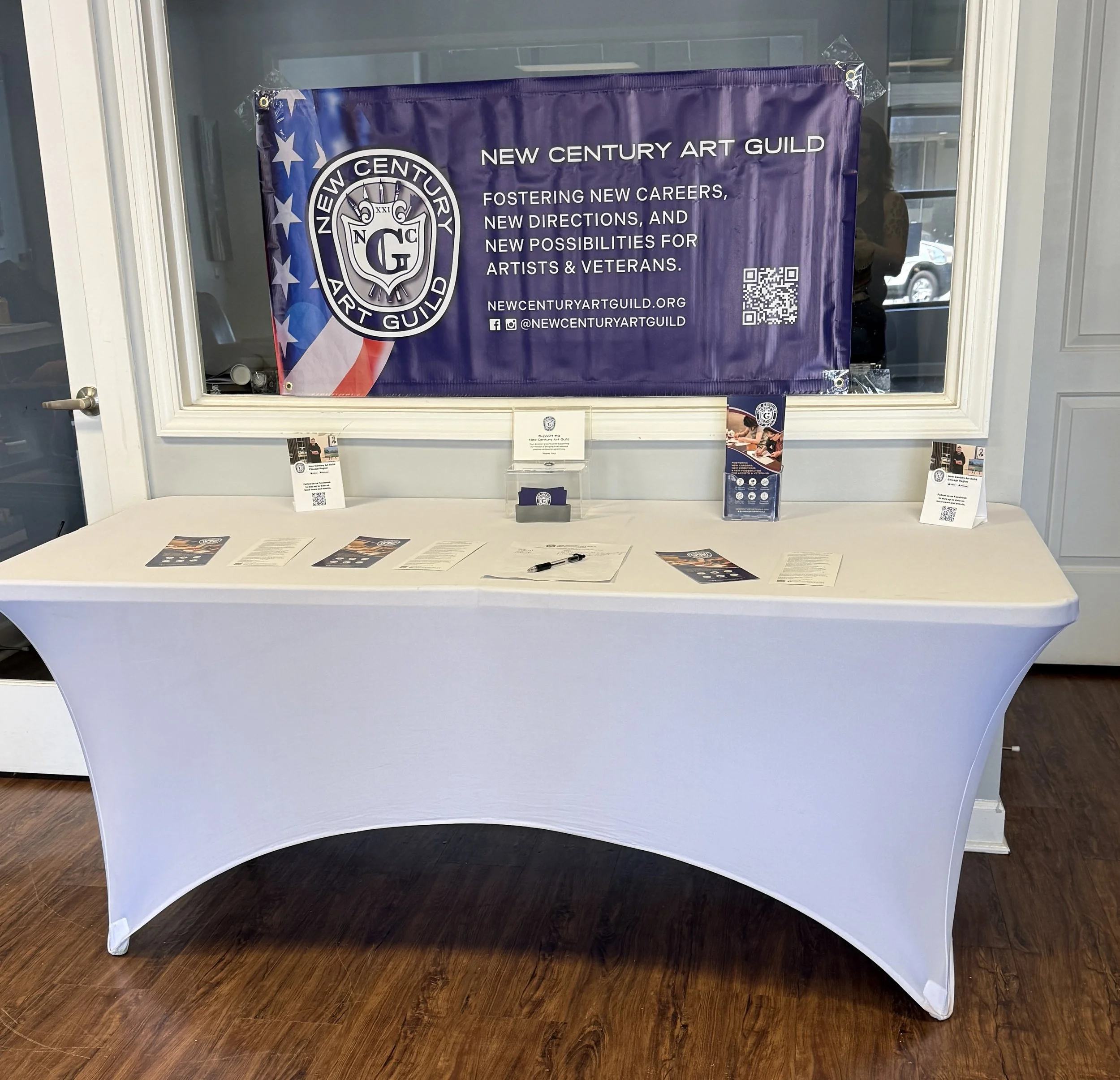
All the parts working together
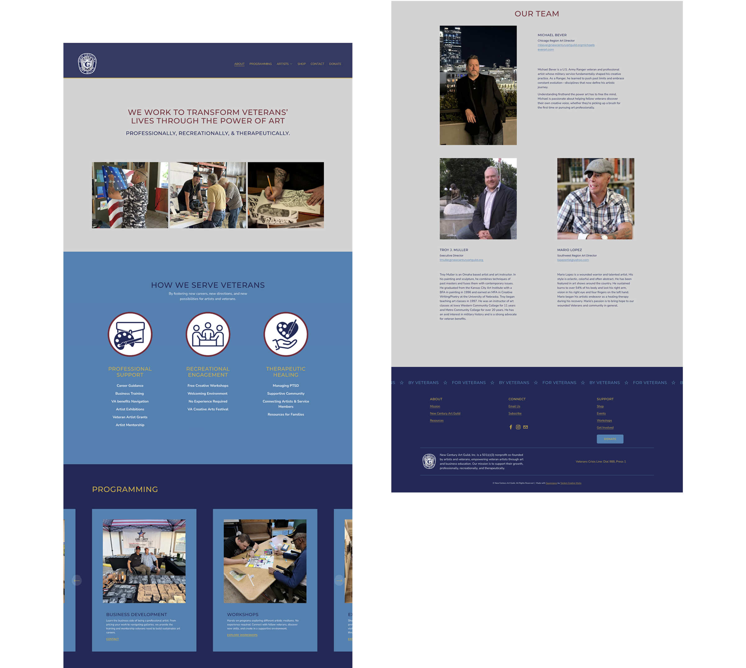
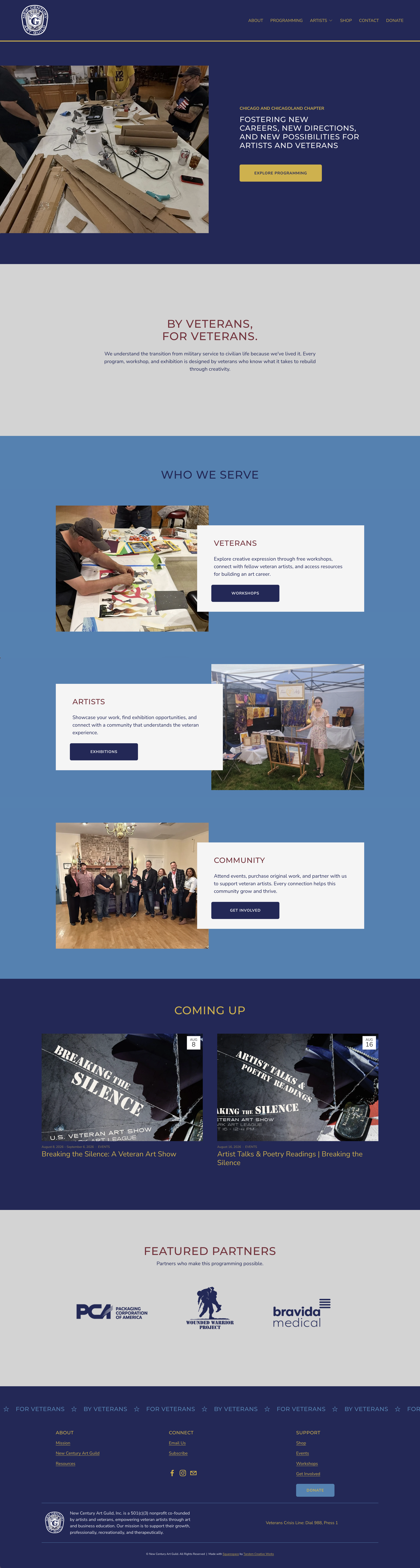
NCAG Chicago Chapter Website View Live Site
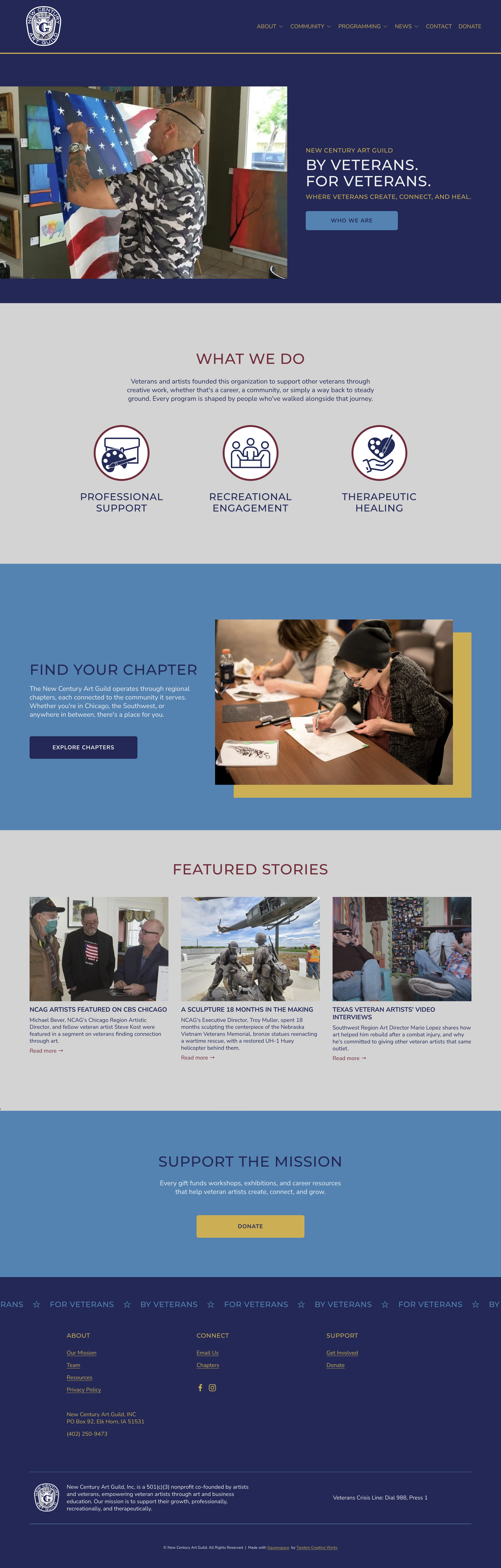
NCAG National Website View Live Site
While each sites serves a different purpose, the 2 sites use the same identity for a cohesive experience throughout the organization.
-
Client: New Century Art Guild (Chicago Chapter + National/HQ)
Industry: Nonprofit / Veteran Services
Services: Brand Identity, Color & Typography System, Presentation Design, Print Collateral, Web Design
Year: 2025–2026, ongoing
Personal Connection: My husband, Michael Bever, is NCAG's Chicago Region Artistic Director and Army Ranger Veteran. This project started because I wanted the veterans he serves to have something worth handing them.
Project Brief: Develop a brand identity for NCAG Chicago and apply it across a presentation deck, print materials, and a full website, all built to introduce the chapter's programming to the Veterans it serves.
Solution: Pulled the color story and typography from NCAG's existing logo, then built that into a full system, extending it into palettes, hierarchy, and application rules the organization didn't have. Applied that identity to a presentation deck, print materials set, and NCAG Chicago's website. I designed full navigation, event filtering, program pages, and a donation flow. When national saw the Chicago work, I designed their site using the same system, with navy headers to distinguish HQ from the chapter level.
Outcome: NCAG now runs one brand and voice system across the connected organizations, built from a single presentation deck that grew into a full identity project. Breaking the Silence, a veteran art exhibition at Oak Park Art League, became the strongest proof of range: exhibition copy, event pages, Instagram promotion, print collateral, a 12-page saddle-stitched artist booklet, and data-merged gallery labels, all built on the system this project established.
-
This project began because my husband, Michael, needed a presentation deck. He's NCAG's Chicago Region Artistic Director, and was giving a talk to introduce the chapter's programming to Veterans who didn't know it existed yet. Before building the deck, I built the identity behind it. NCAG already had a logo, so I pulled the main color and typeface straight from that and built out a real system around it, one they didn't have before.
From there I carried that same identity into rack cards and business cards, something he could hand someone in person and have it look like it belonged to something real. Once those materials were out in the world, the gap became obvious. He had a consistent identity going out in print and a national website that didn't match any of it. So I designed a website for NCAG Chicago, one he could point people to and manage himself.
National saw it and wanted the same look, voice, and identity. That's when this stopped being a favor for my husband's chapter and became a full identity project for the whole organization. I worked through NCAG's existing messaging to sharpen and elevate it rather than replace it. Navy headers on the national site kept it distinct from Chicago's while staying part of the same system. Breaking the Silence put that system to work at full scale: exhibition copy, event pages, Instagram, print collateral, an artist booklet, gallery labels pulled straight from submission data.
Michael has spent years showing up for veterans through art. Getting to build the thing that makes that work visible, and watching it grow into something the whole organization uses, is some of the proudest work I've done.