Chicago Flag Feast A-Z
Flag Feast: A–Z is the Design Museum of Chicago's 2026 flag installation, featuring 26 flags by 26 local artists, each one assigned a letter and asked to interpret it through Chicago's artistic heritage and creative community. My letter was H, with an obvious nod encouraged toward food. The flag flew at Taste of Chicago, July 9–12.
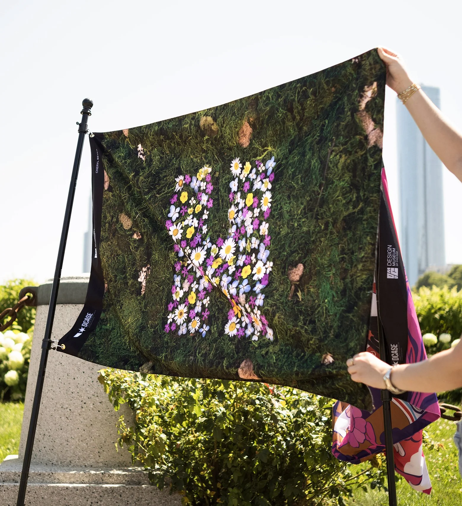
photo by Christian Solorzano
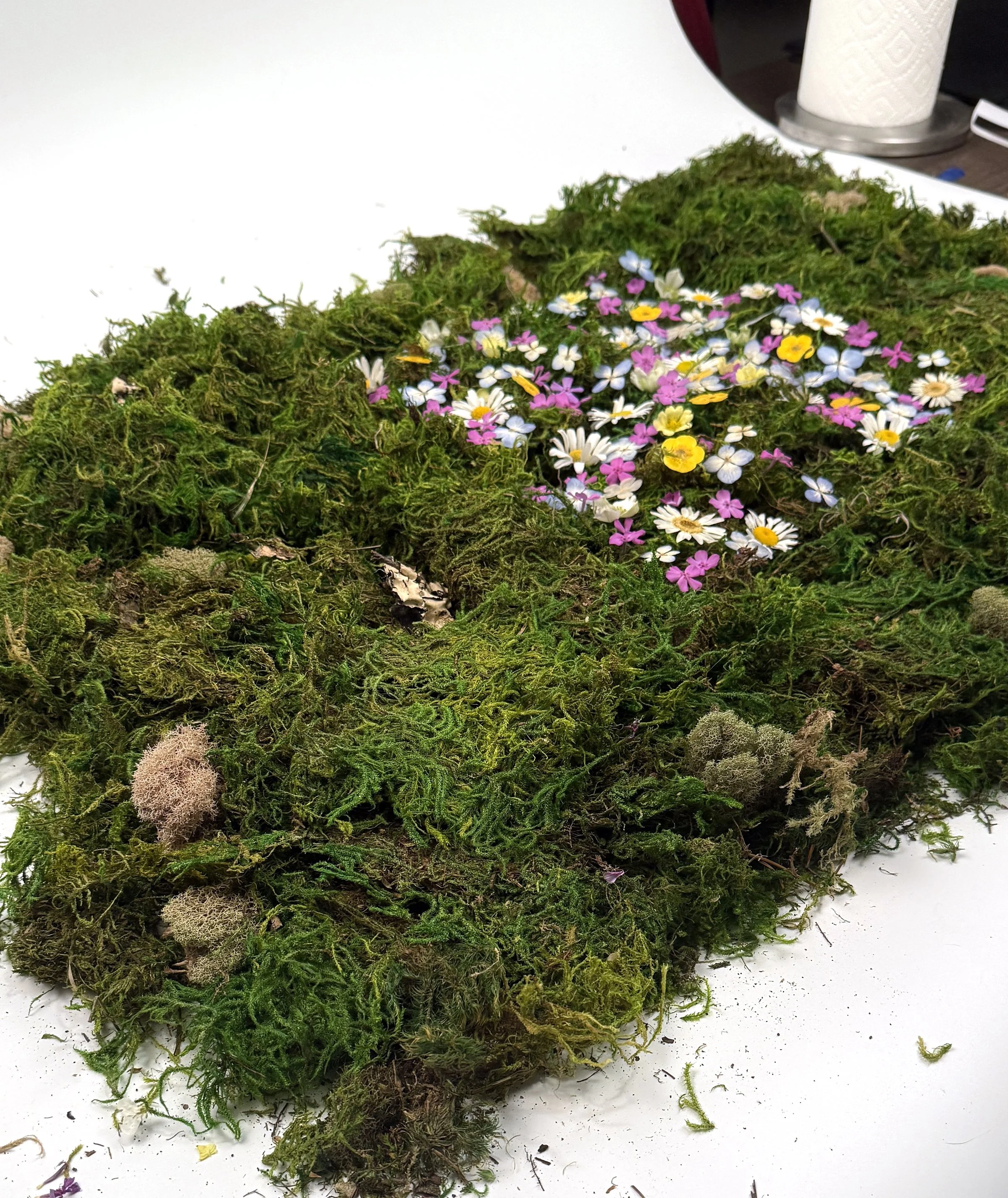
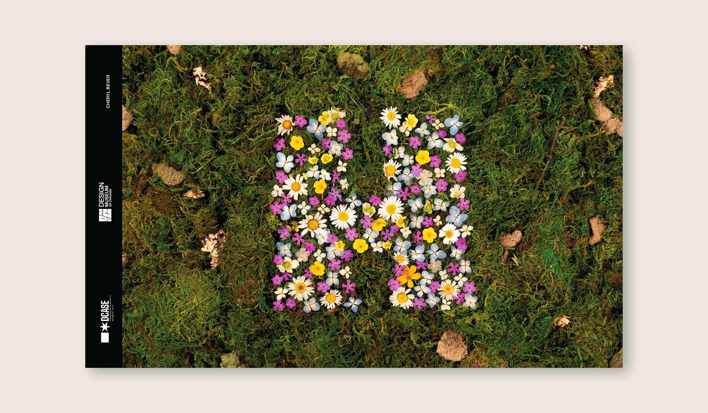
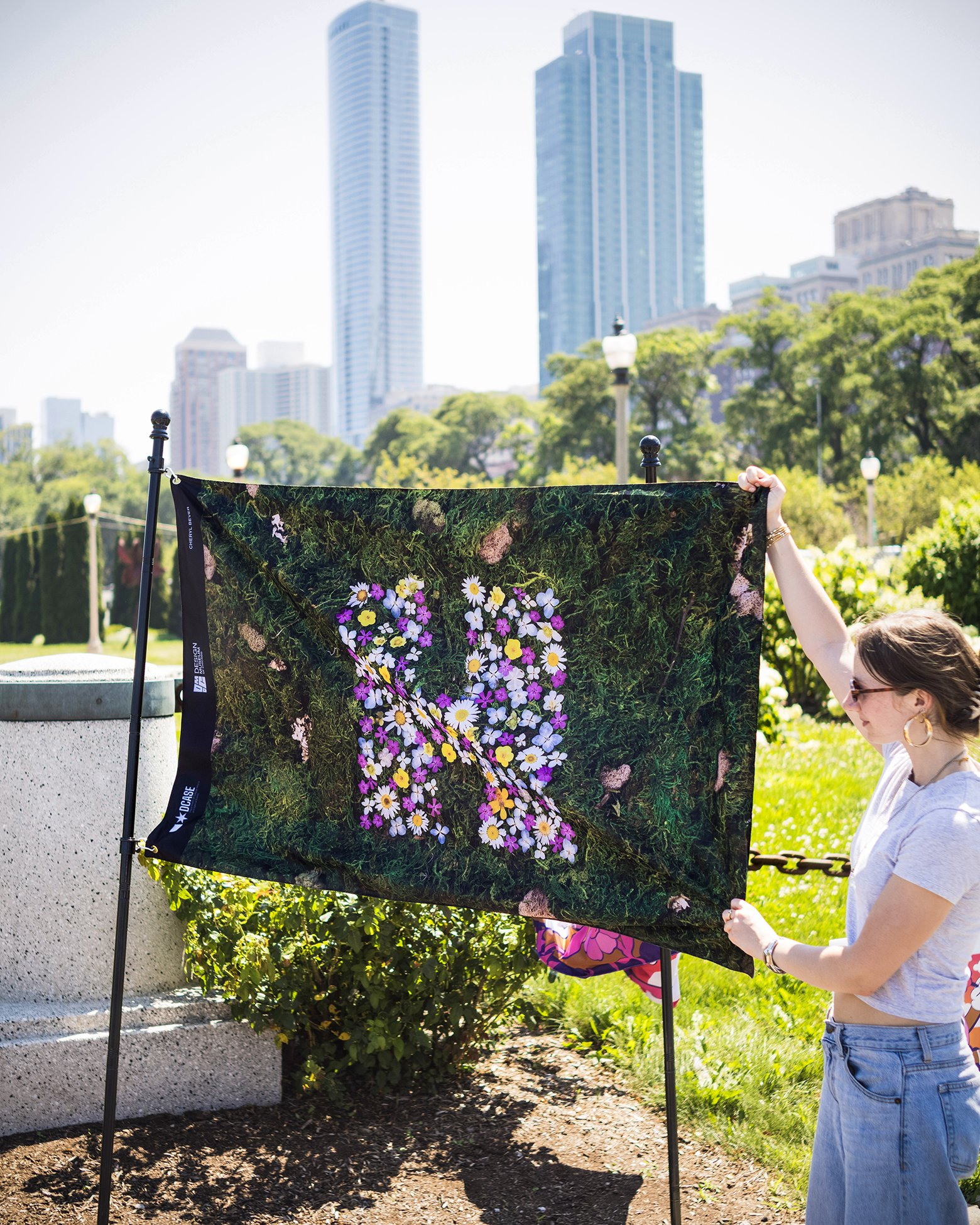
photo by Christian Solorzano, Model: Tori Webb
-
Client: Design Museum of Chicago
Event: Flag Feast: A–Z (Letter H, 1 of 26 Artists) at Taste of Chicago
Project Type: Public Art Installation / Flag Design
Year: 2026
Medium: Pressed and fresh-picked wildflowers, moss, photography, digital design
Exhibited: Ida B Wells Drive, Grant Park, Chicago
Project Brief: Create an original flag design celebrating Chicago's artistic heritage and creative spirit for a public art installation viewed by thousands of festival attendees.
Design Concept: “The organic connection between food, nature, and the act of making begins in the field. Wildflowers feed pollinators and wildlife rather than humans, but they are part of the same ecosystem that brings food to the table. These flowers were gathered from the natural spaces around Chicago and arranged by hand.”
Outcome: Flag flown at Taste of Chicago as part of DMOC's Flag Feast installation, presented with the Chicago Graphic Design Club.
Presented by: The Design Museum of Chicago with Art Design Chicago, a collaboration initiated by Terra American Art
-
I started where you'd expect: food words that start with my assigned letter. Ham, honey, hungry, homemade. I built out a full list, landed on a typographic concept, a dense field of H food words with the letter itself emerging in neon green against a watermelon palette, and started building it out in Illustrator.
About half of the way in, I stopped. It looked good. It just didn't feel like mine.
I pulled up a few past pieces, a botanical logo I'd shot for a t-shirt project, a leaf-pattern flag, a moss lettering piece, and saw the same thread running through all of them: natural materials, organic texture, letterforms that live inside the material rather than sitting on top of it. The food word map was a strong concept. It just wasn't MY concept.
So I started over. Gathered both pressed and fresh-picked wildflowers, arranged into the shape of an H, set against a moss background and I knew this was it. The organic connection between food, nature, and the act of making begins in the field. Wildflowers feed pollinators and wildlife rather than humans, but they're part of the same ecosystem that eventually brings food to the table. I gathered these from natural spaces around Chicago and arranged them by hand.
Most of my work happens on a screen, so I welcome any excuse to work with my hands and real materials instead. This one goes back further than I expected. When I was young, my family had a camping lot we went to constantly, and I built my own moss garden there, the first thing I'd run to check on the second the car was parked. All these years later, I'm still in love with moss.
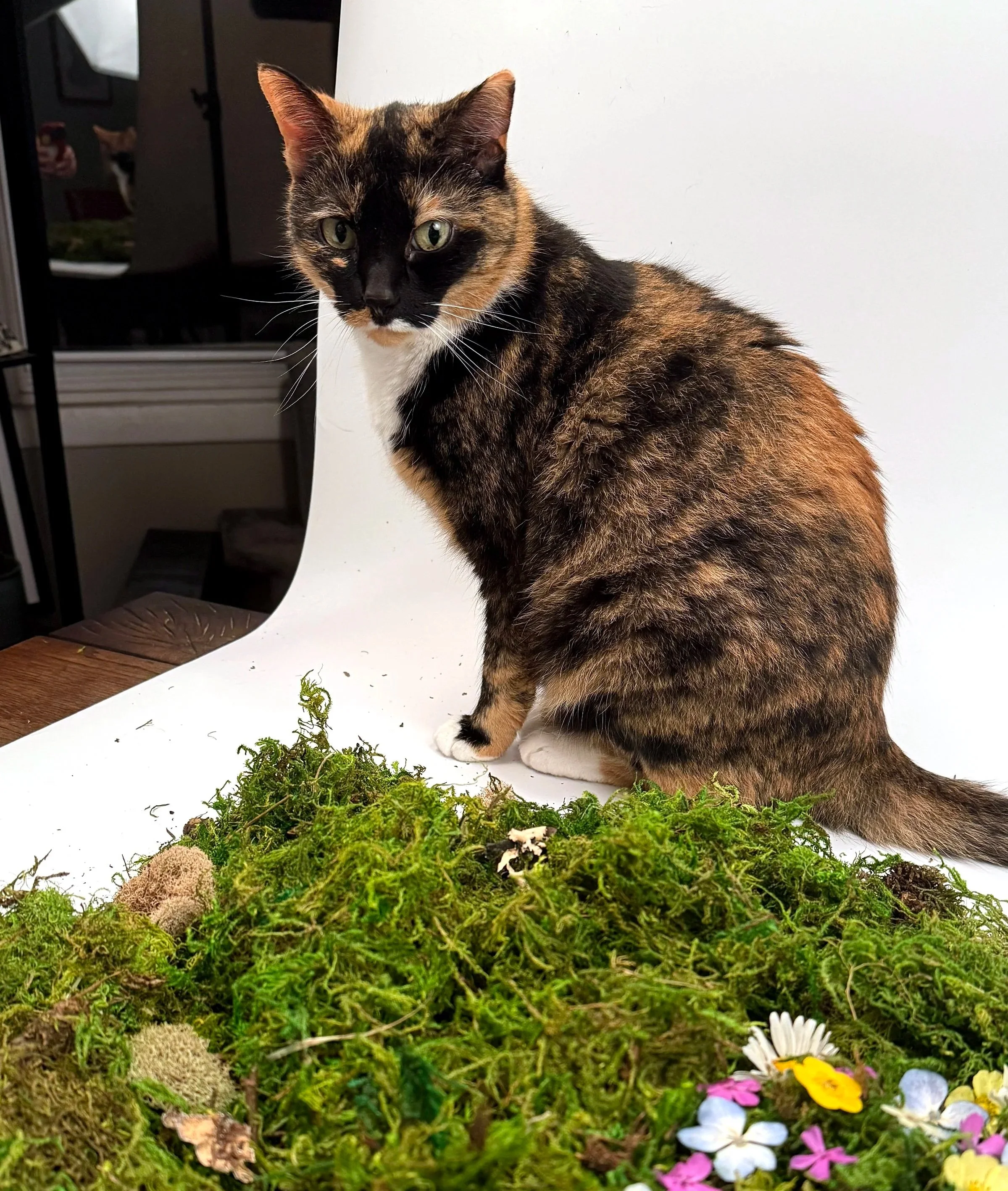
For those that made it this far….here is Lily, proving she “helps”